April 2021 - June 2021
During my Spring 2020 semester, I participated in a competition, hosted by CodePath, where our team build an iOS application focusing on management of personal items. I was leading the project with 3 other developers.
Growing up in a large family, I often struggled to keep track of our household belongings. Foods, occasionally, reaching expiration date without anyone knowing, clothes getting unused for years, items getting lost or unnoticed. So we decided to ask the question.
How can we create a system that will allow people to keep track of all their items with minimum effort?
Since the scope of the competition was within the iOS framework so we decided to develop an iOS Application that will specialize in assisting users in managing all forms of items.
I surveyed over 20 users ranging from families to people living by themselves to understand their experiences with managing their personal household items. My team clustered the users from experience level with past management tools to openness to trying a new app. I summarized their responses to what would make them use the app more, although hindsight, I would've asked a follow-up question to further evaluate their intentions behind their response rather than trying to speculate myself.

We used the response from the top quadrant (openness to new app) as our base guideline for conceptualizing the features we implement and the overall structure of the app.

I decided to go to the app store to explore some of the popular management tools, to figure out what application I potentially use for my current household item management.
What I found is that most apps either focused on business related inventory, very specific category of items or is generalized for all forms of management which made it less seamless for managing all types of household items.

I wanted to focus on the cross section of making the app specialized in item management for a more seamless experience since we focused on narrowed use cases, but generalized for all forms of items so that the users have the flexibility to manage all their items in one app.
We brainstormed a list of principle goals behind our that will make our app "stand out" and we decided on choosing the combination of the 3 principles shown in the picture below.

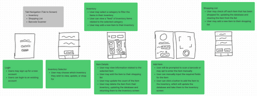
Based on the higher level feature goals, we made a list of specific tasks that we wanted our app to perform and based on that, I created a general screen archetype, illustrating how each screen is performing a list of the tasks we discussed.

Based on the Screen Archetype feedback, I created a wireframe and user flow throughout all the screens within our app to ensure a general understanding of our app to everyone in our team. We decided to not focus on the barcode scanner since we were unsure how feasible it was, so we decided on a user info page instead.

Based on the wireframe, I designed a higher fidelity prototype of our application for user testing, since it was easier to prototype multiple screen variations and test it out than develop all the screen variations just for user testing.
It also served as a better guideline for development, although our goal behind the app was not to be pixel perfect, but get as close to it as possible.


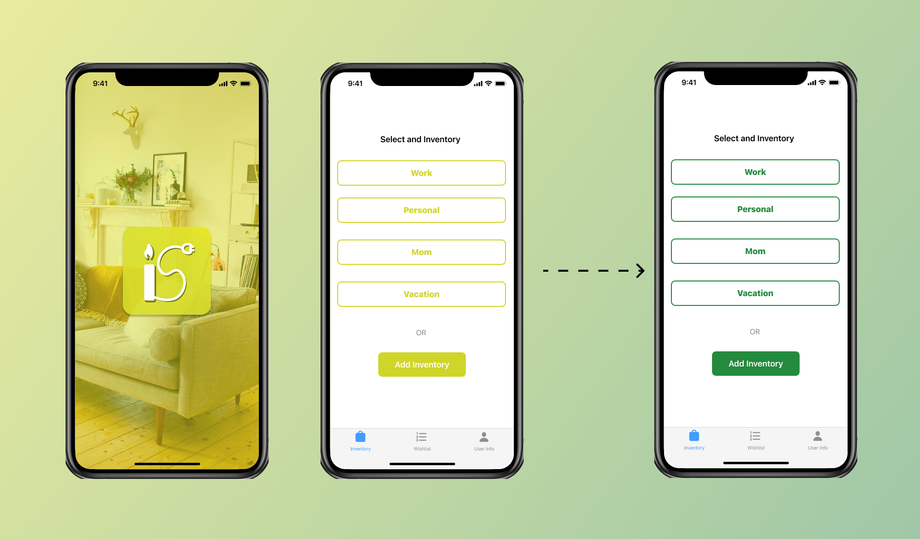
My initial color scheme was based on the color scheme of my application logo; however, it did not pass the Web Content Accessibility Guidelines (WCAG) which was specified by the Apple Human Interface Guidelines, so I went with the default Accessible System Colors that Apple Specified.

While brainstorming multiple use cases, we realized that the list page could be used for more than just groceries so we changed the name to "Wishlist" as it was more generalized (follows one of our app principles better), although hindsight, I would have gone for a more general "List" name for that page.
We also wanted to bring more dimension to this page as it currently only served as a basic list, so we wanted to integrate the ability to move the items from the list to a specific inventory so we tested out 3 different designs. The users had the least difficulty in completing their tasks with the 3rd screen, although one of the struggle points was the use of the word "add" in the add selected item button, which sparked confusion, but some of the users preferred the buttons being clustered together with the shorter name and icon, which made it easier for them to follow. The buttons also took up the same amount of vertical space so it would not pose any additional challenge while scrolling for longer lists.

We realized the the usage of words like "expired" meant that we were limiting the scope of the items and also the notes sections within the item detailed served no purpose unless the user pressed on the item to update the item, so we switched "expired" to "reminder" and the notes as the notification body.

Another major flaw in our app design was the inability to choose the time for item reminder, so I switched the design to accommodate time selection while trying to avoid too much information within the frame.

The Button Layout was very confusing for the users since there were two buttons performing the same task. I tested out two different designs, the users took less time to recognize the purpose of the button with just the icon, but besides that the users succeeded in completing the tasks with both buttons.

One of our primary problems with our current app is the initial hurdle of putting all of the items in the application, so a future goal that we wanted to focus on was the ability to add multiple similar items together without having to name and categorize them one by one. A solution that we brainstormed was the ability to select multiple photos from camera roll and name all the items once. We also wanted the user to have the ability search items since after an item threshold finding items through just categories may get difficult.

The App was certainly a learning curve for me since it was one of my first project where I worked solely as a designer so it was definitely a learning curve since I was not used to facilitating usability tests, brainstorming decision and effectively communicating to the dev team.
I tried to keep my design to a minimum since the developers were still learning the tools that they were using, but one of my key takeaways from this project was that sometimes simple designs can be a more effective design choice.
- We were working with skills and time constraint so I focused on keeping the design changes to a minimum
- Difficulties in developing a proper plan in terms of milestones. A huge portion of our decisions were done throughout our development journey, ideally we would have loved to build a rough plan, but it was difficult for us to do so since we could not predict the workload expectation for certain screens/features due to lack of prior experience.
There were a few features that we did not have the time to develop so we would have ideally build a product with all the required features for launch and then iterate over it, that way we would have gotten feedback from users using the product in their natural state, which we were unable to do since all the tests were done through the prototype.